How to Create The Best Facebook Ad Design
- Apr-05-2018
- Dilawar Hussain
- 1 comments
You have already created your shiny new Shopify store from scratch. You know who your customers are and you have already figured out which killer product you want to sell.
Well, it’s not done yet, there is still a long way to go before you see that first sale. If you are the the kind of person who believes in forcing fate’s hand then we’ve got you covered.
We are going to dive into Facebook Ads and how you can leverage Facebook marketing to bring in more sales.
If the thought of creating the best Facebook Ad design sends shivers down your spine then let us assure you there’s nothing to worry about.
You don’t have to be the best graphic designer to create an attractive Facebook Ad that actually converts.
You just have to learn the fundamentals of a good Facebook Ad which includes attention-grabbing images.
According to ConsumerAcquisition, around 75-90% of Facebook ad activity/performance is directly related to the images used.
Combine that with the cut-throat competition and you get a social media advertising platform that can make or break your business.
However, if you know how to create the best Facebook Ad Design then you are already miles ahead of 60% of the competition and today, we are going to do exactly that.
Let’s get this class started.
Don’t Skip These Important Questions
First of all, make sure that your marketing message is crystal clear and only then you will be able to create the perfect Facebook Ad Design.
Ask yourself these questions:
Who is your target audience?
What kind of people you want to target, what do they like, what are their interests, their age, their geographical location, etc. Understand your target audience.
What products/services are you offering?
What is your product or service, what it does, who it is for, etc. Make sure everyone knows what your product does.
What value does your product/service provide?
Your value-proposition should be absolutely clear. Your potential customers should know what value you are providing to them.
What do you want people to do when they see your ad?
You should have a single Call-to-Action (CTA) in your ad design. Make it clear what you want people to do. Subscribe to your mailing list? Like your page? Buy the product?, etc.
If you can’t answer these questions clearly then no amount of ad designs or high-quality images can help you.
So, before you move forward. Try to answer each question, use a notebook if you want, jot down each point. Learn it, embrace it, and represent it.
Done? Now, you’re ready to embark on your Facebook Ad Design journey.
Choose Your Ad Type
You are now all set to make your first Facebook Ad. Don’t worry, we’ll help you out with each step.
First of all, let’s take a look at all the different Ad types available on Facebook. There are 6 different ad types you can choose from.
- Image Ads – Single Image
- Carousel Ads – Slider with multiple images
- Video Ads – promotional video
- Slideshow Ads – Video with up to 10 images
- Canvas Ads – Mobile only ad experience
- Collection Ads – Allows interaction with your ads
All different ad types can definitely get a bit overwhelming for the newcomers, so we are going to focus on two ad types for now.
These are Image Ads and Carousel Ads.
1. Image Facebook Ads
This ad format lets you use a single image in your ad design. Here’s an example of a single image ad with a single product from Maserati USA.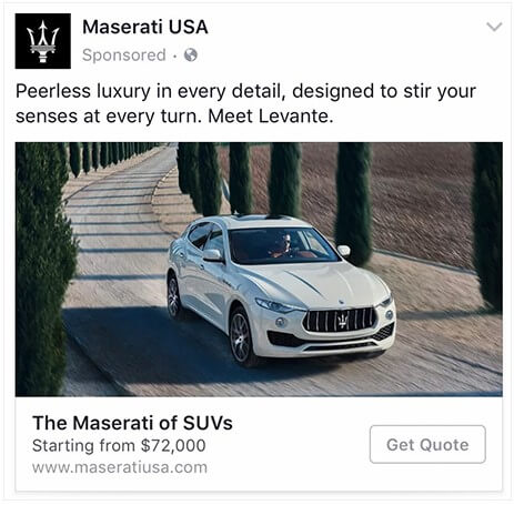
But, that doesn’t mean your single image only needs to show just one product. You can actually show multiple products in one image to provide your audience with extra information.
Check out this single image ad (with multiple products) by Fifth Avenue Clothing.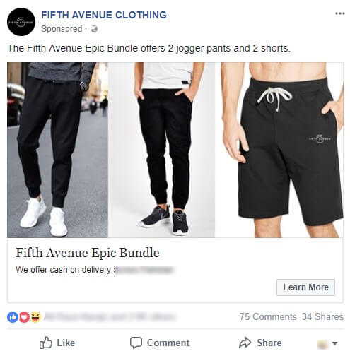
By having multiple products in your Facebook ad, there are always higher chances of people liking at least one product and clicking through it.
It’s always the best idea to include multiple products in your image unless you only sell a single product/service.
2. Carousel Facebook Ads
If you want to use multiple images in your Facebook ad then carousel is your answer. This ad type is a bit more dynamic and gives you more freedom with your ads.
You can also use GIFs in your carousel ads which means you can have multiple GIFs in your carousel ads with each GIF showing a different product in action.
You can add up to 10 different scrollable images in your ad using carousel which means you can feature more products in a single ad.
Take a look at this carousel ad example from Alibaba.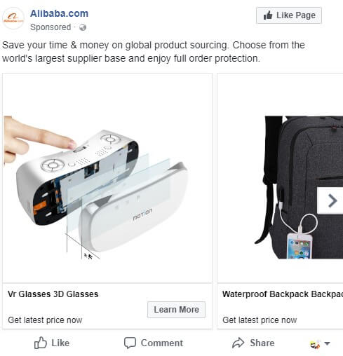
You can see how they are showcasing multiple products in this carousel ad. You can use carousel ads in any way you like.
According to Digiday, carousel ads are at least 10 times better than the single image ads.
You can tell a story, show different products, show same product with creativity, etc. It’s all about thinking outside the box when it comes to carousel ads.
Single image or Carousel ads?
This is the million-dollar question right here. Should you opt for the simple and straightforward single image ads or go for the flashy carousel ads?
Well, it depends on how comfortable you are with the ads. If it’s your first time creating Facebook Ad design, we suggest you stick with single image ads. Learn the ropes.
Once you have enough knowledge and a great collection of images, you can go for carousel ads.
If you know what you want to make. Let’s move onto the really fun stuff. Making your first Facebook Ad Design.
Choose The Perfect Image
When you ask any Facebook advertiser what’s the most important thing in Facebook ads. They will tell you that images can make or break your entire ad design.
It’s the real attention-grabber in your ad and without an attractive image your ad will definitely fall flat.
Here’s are three things you should keep in mind when choosing an image or multiple images for your ad.
Use High-definition images
People don’t like blurry or low-quality pictures. So, make sure that whatever image you choose, is of the highest quality and crystal clear.
Hire a professional photographer to take high-quality pictures of your products and showcase them in your ads. Play with filters and overlays to add some vibrancy to the images.
Use Complimentary colors
Facebook sports a blue and white theme. So, make sure that you don’t use these colors in your ad or you risk getting your ad to blend in with the site’s theme.
Your ad needs to pop out, your ad needs to make people stop and look at it, how do you achieve that? Colors!
Use colors to make your ads pop out and hit your viewers right in there brains. Use contrasting or complimentary colors to make your ads flashy.
Check out this color psychology chart by Boutique to understand what emotion does each color represent.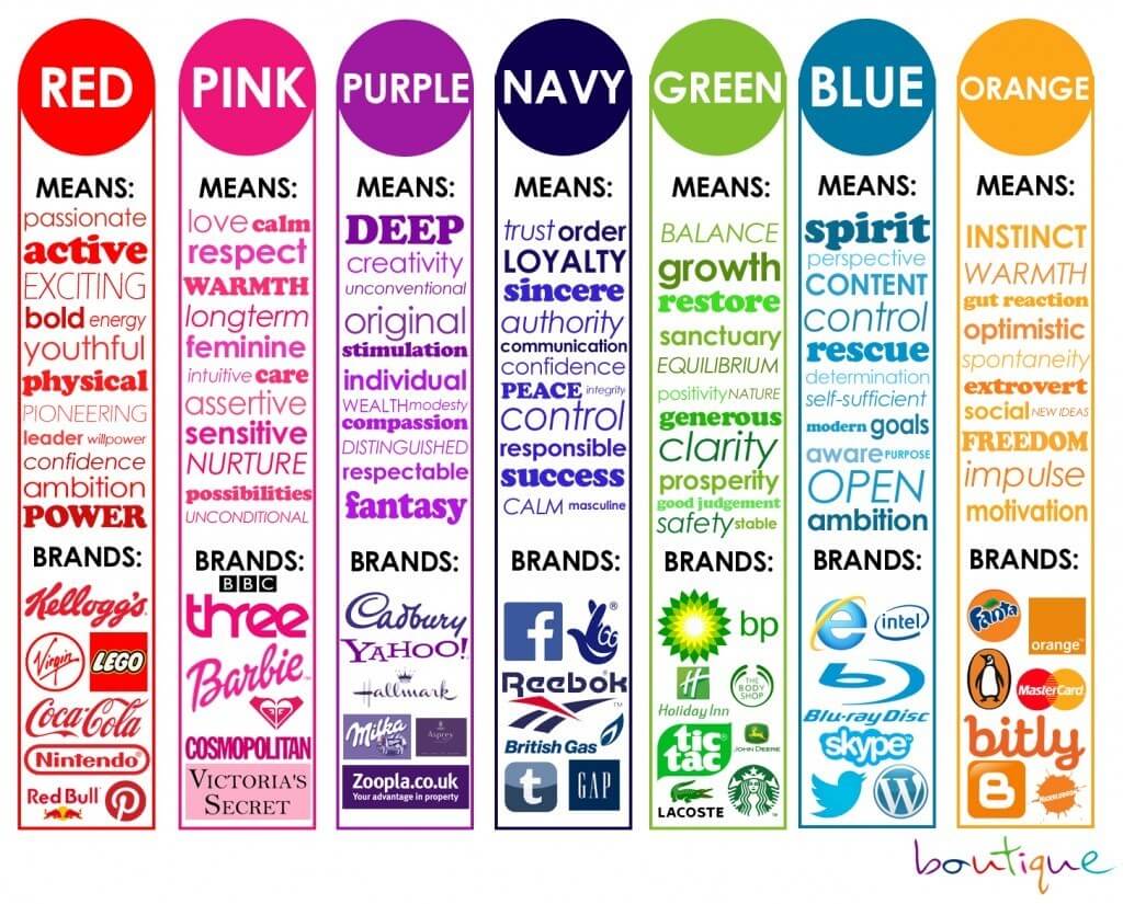
Play with your users’ emotional and rational sides
Humans are intelligent animals who like to think rationally; however, when it comes to making decisions we also rely on our emotions.
Some people can be entirely emotional while others are more rational. You need to understand and address both these sides of your users.
A simple list of your product’s features may be able to convince the rational part in your users, but it will have no effect whatsoever on their emotional side.
Our emotional side does not care at all about features, specs, etc that part only focuses on feelings and benefits.
Words like save money, simple to use, makes you happy, etc will always affect the emotional side of your users.
Choose an image that conveys the emotions you want to express. Use similar words to strengthen that emotion and make your users actually feel something.
Here’s an ad by NatureBox that uses words like delicious, tasty, free, etc to entic their viewers.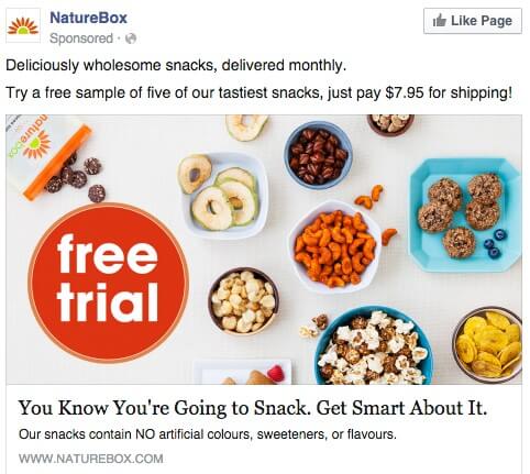
Make your product the center of attention
A great image is worth a 1000 words, or so they say. According to a research by the University of Iowa, we actually remember the things we see far longer than the things we hear, obviously.
What does this mean? Well, simply it means that you need to put your product at the center of your ad. Make it the star of the show. This way people will remember it for a much longer time.
In this Facebook ad, GoPro boldly showcases their GoPro Hero camera.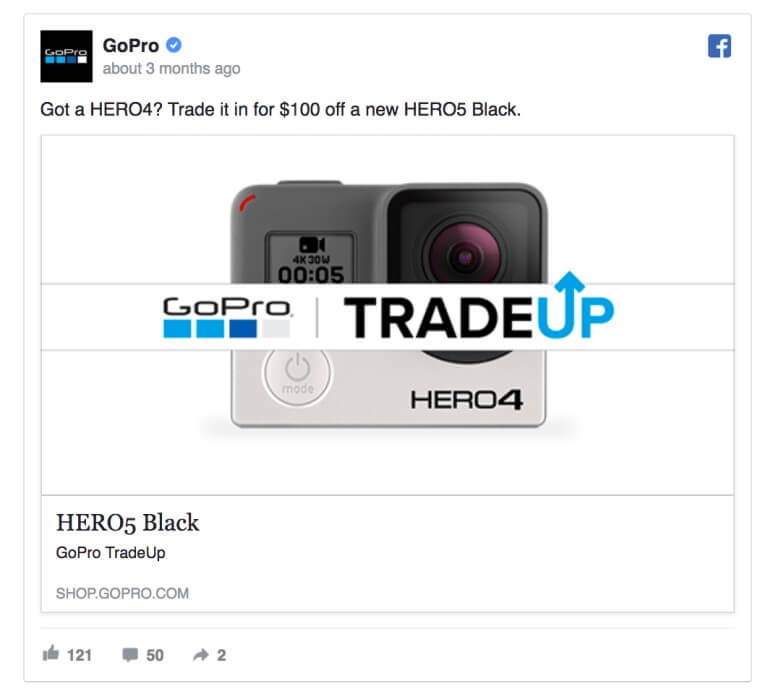
You can even use the product images you get from AliExpress or any other supplier you are using for dropshipping, but make sure that you edit these pictures first to make them look professional.
The best method is to take your own photos of the products. You can stand out from your competitors with beautiful, professional photos.
People love other people
That statement might sound like something you would hear in a spirituality class, but actually people do prefer other people when making decisions.
How? According to Psychological Science research, looking at a photo of a smiling person makes us happy and safe.
What does that tell you? When you use a real person in your ad photos, people are more likely to relate to them and feel as if they were in their shoes.
Make sure that the people in your photos are actually similar to your target audience so they can relate to them.
Here’s a great example by Plated.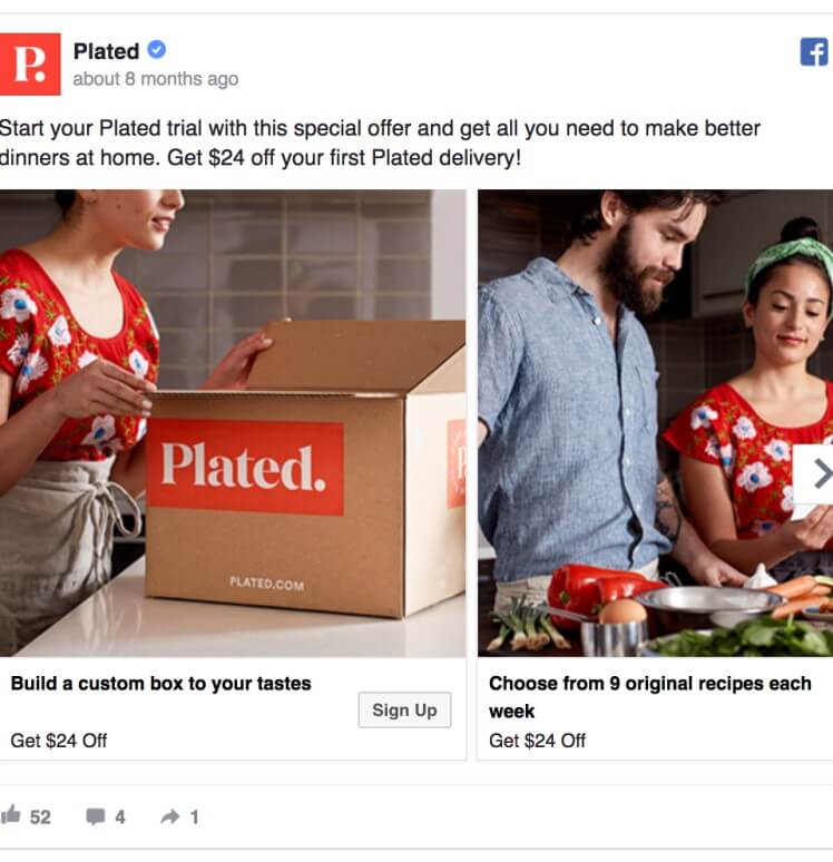
They are using a carousel to tell a story about how a couple is cooking dinner at home instead of going out.
This helps your viewers relate to the people and imagine themselves using your items which ultimately makes them more likely to buy from you.
Use 1-2 different elegant fonts in your image
If your image includes some text then make sure you use the same font or just two different fonts for it.
The font choice should be classy (sorry no Comic Sans) and something that’s clear. Make sure that it goes with the essence of your products or company.
If your target market is trendy then using hip new fonts might resonate with them. Use fonts that will appeal the most to your target audience.
Check out this ad example by Infusionsoft.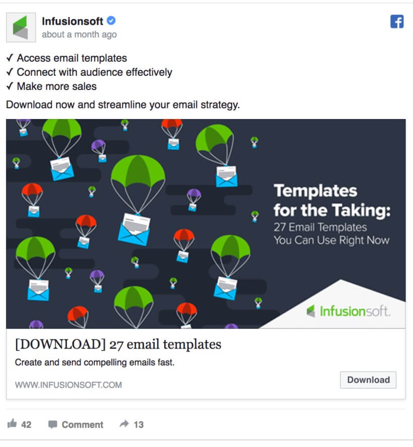
In this image they sick with just two font choices and both simple. It allows their message to be crystal clear and easy to read.
Notice the dark greyish colors in the background, and how it makes the text and graphics pop out.
This is how you should position text in your images, should you choose to use it. It should be short, sweet, and straight to the point.
Your Facebook Ad Design should match your store’s theme
According to a study by McKinsey & Company, customer’s crave consistency when it comes to customer satisfaction.
The moment they see an ad and the moment the visit your store, they expect everything to be consistent.
How does your ad design come into play? Well, when your customers look at your ad and find it attractive enough to click, they actually expect your store to sport similar visuals.
When your ad design matches the your Shopify store theme it creates a consistency for your customers which ultimately boosts your sales.
So, always make sure to create ads, even different store pages with the same layout and style. Anything wildly different in terms of graphics might deter your customers.
Create Your Best Facebook Ad Design
Now’s the time to get working on your Facebook Ad Design. All that you have trained for so far will be put to test.
Before you begin, you should keep the Facebook ad guidelines in your mind. So, make sure that your design is at least 1200 x 628 pixels in size.
You are probably worrying about how you will always find graphics and images adhering to these guidelines, right? Well, worry not, as always we’ve got your back.
You don’t have to worry about anything as long as you use Canva – a free tool that does all the work for you.
So, let’s get started.
1. Create A Canva Account
This one is simple and you can probably do it with your eyes close, or maybe not. Head over to Canva and register yourself for a free account.
Once, signed in hit “Create a design” on the left sidebar.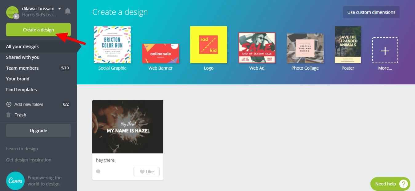
Now, under Ads, you will see Facebook Ad design. Select it.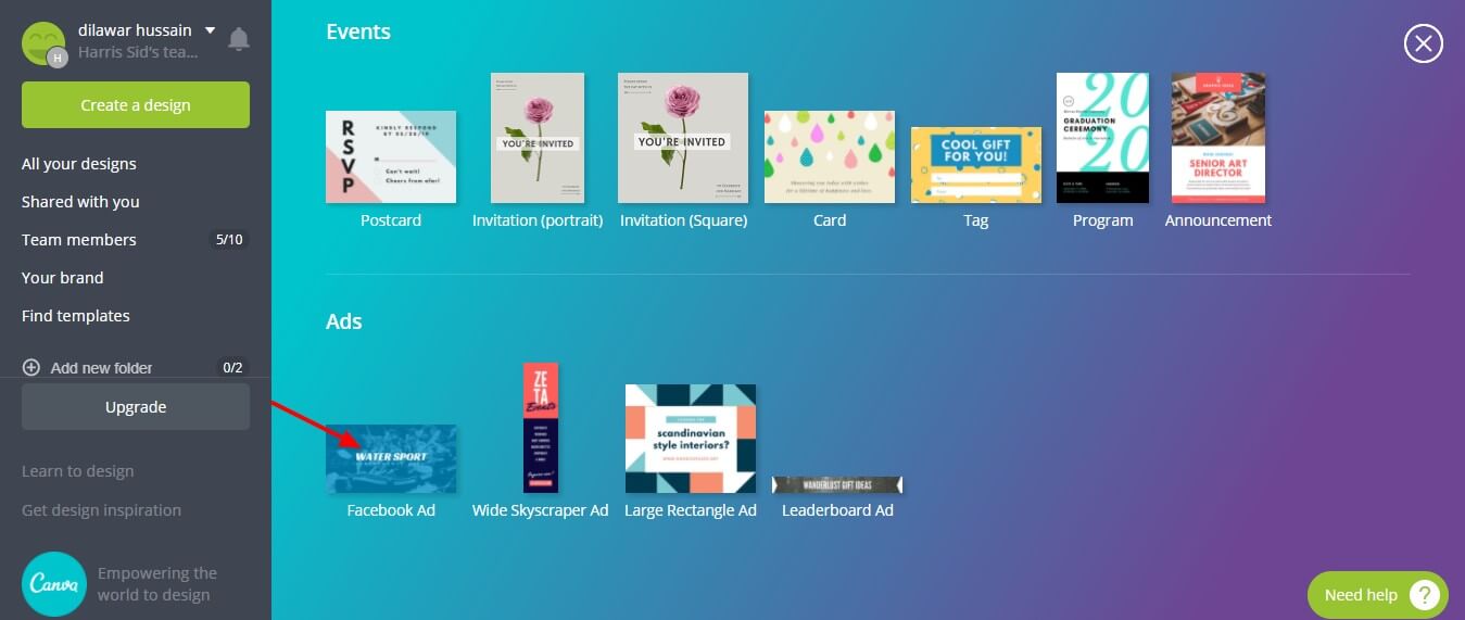
2. Select a layout
Now, that you are in the designer. Select Layouts from the left sidebar. There are numerous free layouts available.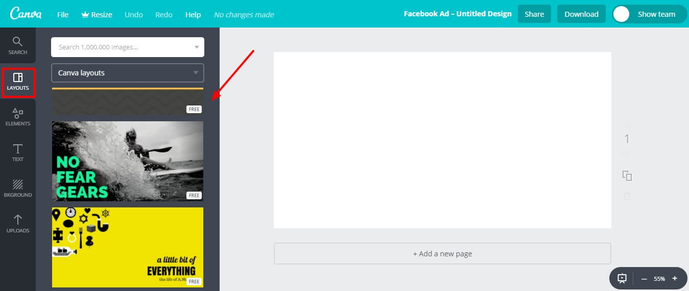
Select a layout that you like. We went with Luxe as it comes splitted in two parts which is great if your graphics designing skills aren’t that high.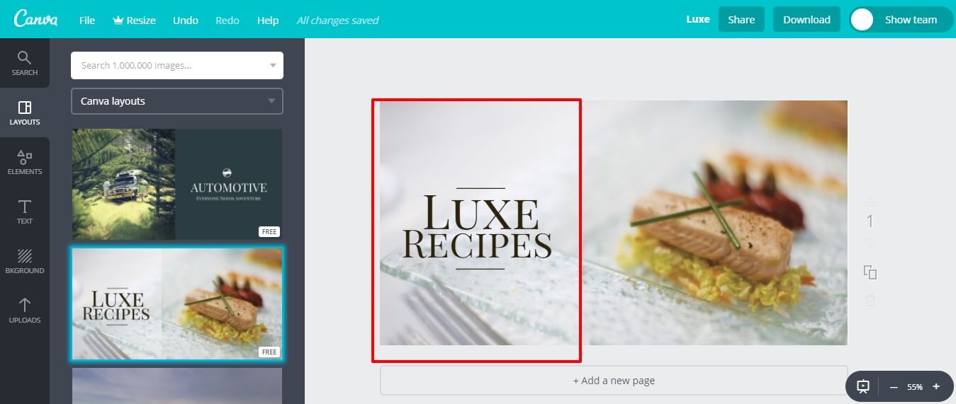
Here’s an example of a two part image ad from Updatable. It looks neat.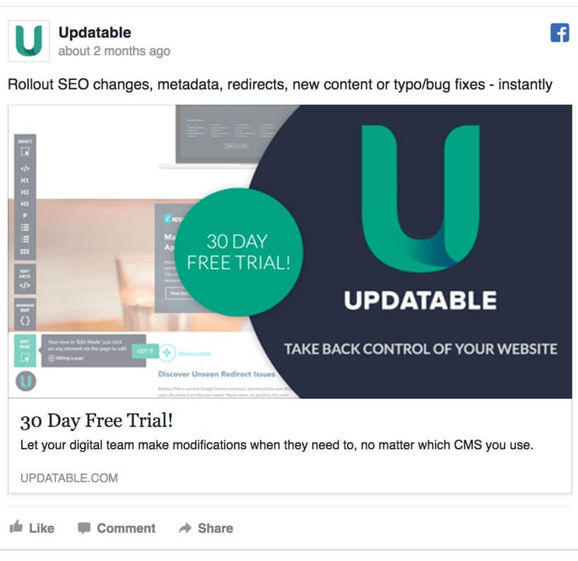
You can see how they use their app dashboard in the background, which is faded while everything else pops out.
Splitting an image in two also works great when you are low on product photos.
3. Use Your Own Image
Now’s the time to upload your image. Click “Uploads” on the left sidebar and upload your custom image.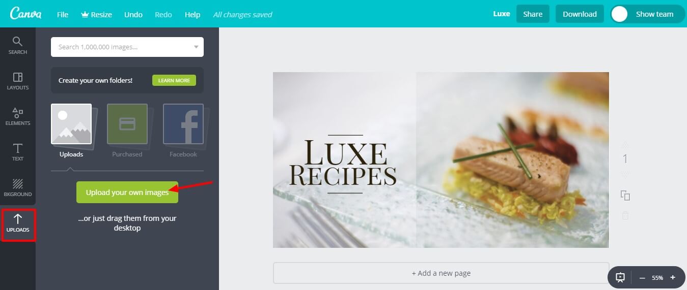
Upload any image you want to use in your ad design. We have already taught you how to choose the perfect image. Now’s the time to put it to test.
You can also upload your logo, as a logo on your ad will reassure your viewers that you are an established business.
4. Using Colors
Canva allows you to edit colors of any elements in the layout. Click any elements and you can choose different colors for it.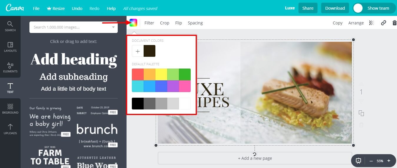
Use the color psychology to your advantage and choose colors that actually resonate with your audience.
5. Add Text to Your Design
You now have created a great image layout, but it’s still missing one vital piece, that’s text.
You can easily add text to your Facebook ad design by clicking the “Text” option in the left sidebar.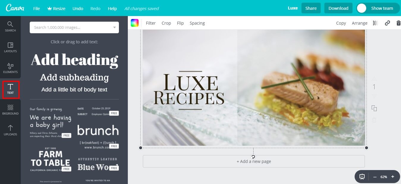
Choose any style or format of text you like it add it to your design. Make sure that it goes along with the image and the design of your ad.
Adding text to your Facebook ad design can be tricky, but we’ll cover it in detail so you don’t have any problems using it.
Adding Text to your Facebook Ad Design
Why is it tricky to add text, you ask. Well, Facebook wants you to keep the text to a minimum in your ad design.
Facebook really hates ad designs with too much text on them. If you include a lot of text, Facebook will limit your ad’s reach.
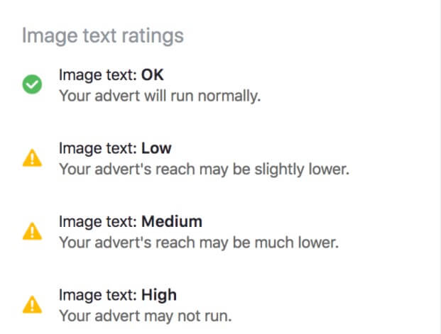
Your Facebook ad falls into one of the following classifications depending on how much text you put on them:
- OK
- Low
- Medium
- High

Here’s a beautiful mountainside image without any text. You can see how Facebook gave it a green OK.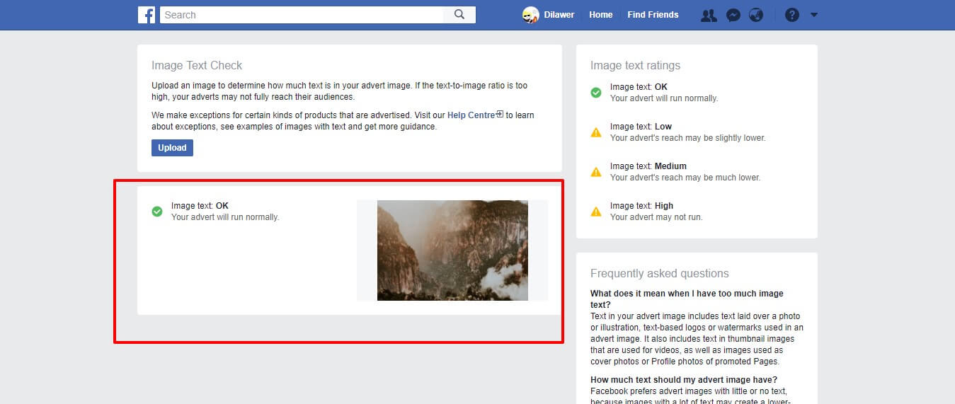
Now, here’s the same mountainside image with quite a bit of text all over it. You see how facebook hates it now and probably won’t even run it.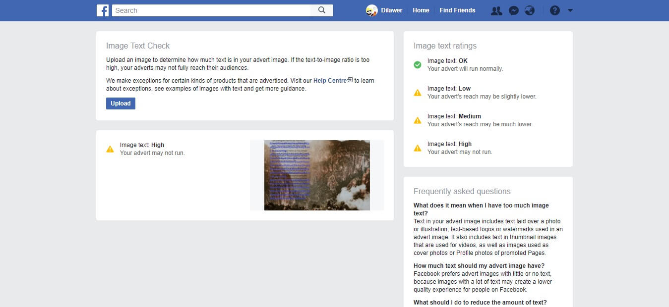
So, when you are choosing to put some text on your design. It’s always a great idea to choose a few words that convey your message across the audience.
What Should your Text Include?
You are probably wondering what should your text actually include when you have to keep it to a minimum.
Here are a few things you should keep in mind when adding text to your Facebook Ad Design.
Add a clear value proposition
It’s always a great idea to add your value proposition in your Facebook ad design.
Your value proposition is the statement that summarizes why a person should actually buy your product/service. It tells the consumers what’s in it for them.
Check out this example from ShortlistBeauty.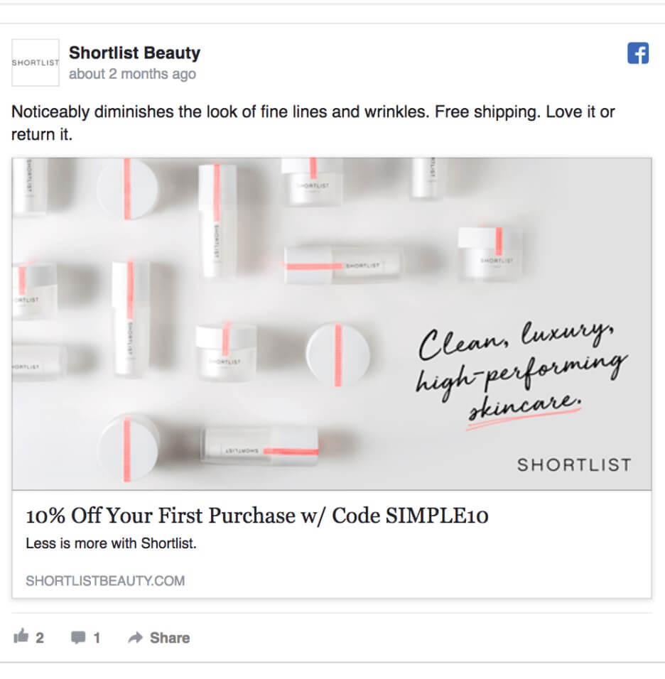
They sell skincare products to provide everyone with products that keep their skins healthy.
Their value proposition is simple “Clean, luxury, high-performing skincare.”
When thinking about a value proposition, ask yourself, what problems are you actually solving for your audience.
Add a single Call-to-Action (CTA)
We already know how important a CTA is for your ad design. Now’s the time to use it directly in it.
There’s going to be a CTA available in your Ad design, but you can make it pop-up by incorporating it in your image.
This way people will always know what you want them to do next. Here’s a great example by GetResponse.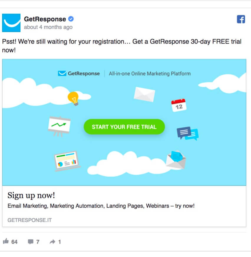
They want you to sign up for a free trial so the “Start Your Free Trial” CTA is the center of attention in their ad design.
Entice your audience with an offer
People love and often crave great offers. Stuff like free samples, free trials, 50% off, etc quickly catches the attention of users.
Use this to your advantage. Add an offer in your ad and try to grab the attention of your target audience as quickly as possible.
Check out this ad example by Marvel.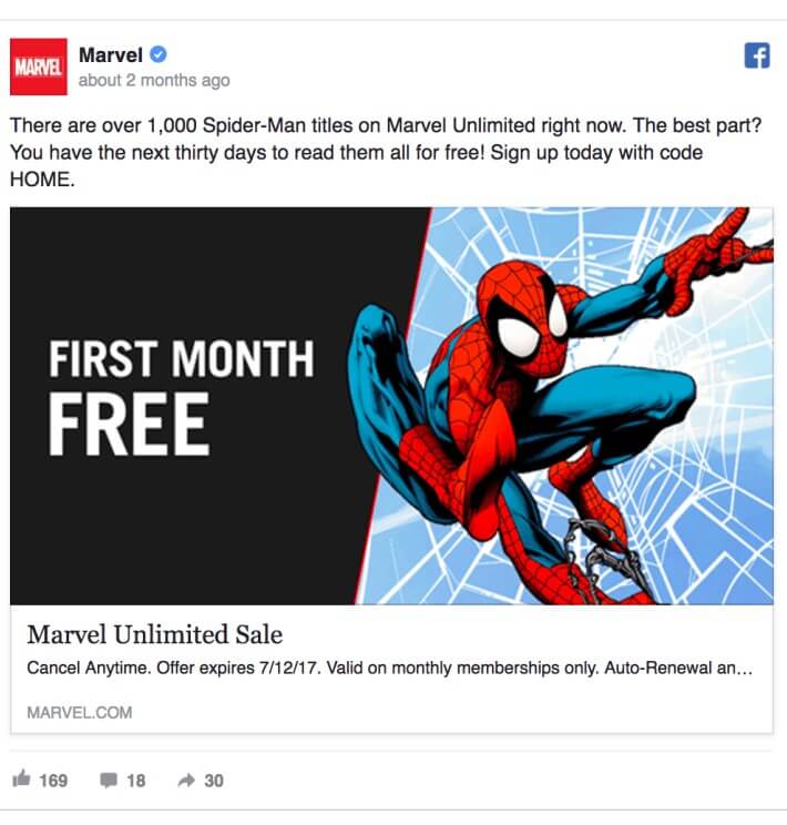
They emphasize the word “Free” and provide their audience with whole month of free comic-reading. This gets the masses riled up and ready to act on your offer.
Use Social Proof to your advantage
We already know people love people. When they see another person in an ad they can actually relate to them in some way.
Now’s the time to take it up a notch. Use social proof. If your business already has satisfied clients, customers, etc consider using their testimonials, feedback in your ad design.
You don’t even have to use any people in your ad. You can just use something simple like how Dropbox does it in their advert.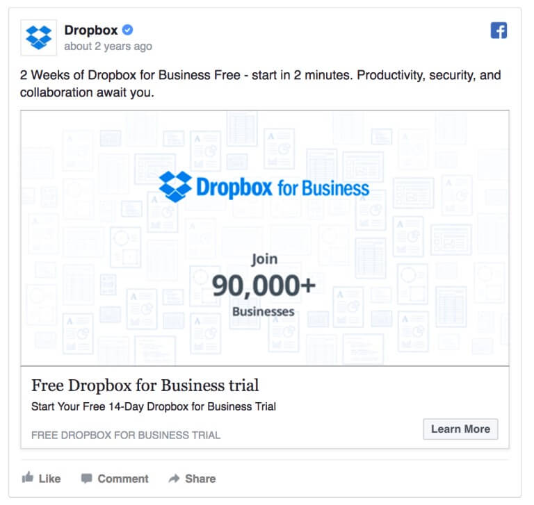
They simply state “Join 90,000+ businesses” what does that tell you? It tells you they are already a well-established business servicing around 100,000 businesses.
Use this simple tactic to entice the consumers and make them take the action you want them to take.
Download Your Facebook Ad Design
Once you are done editing your design, it’s time to download it and show it to the world.
From the Canva dashboard, hit the “Download” button and download your Facebook Ad Design.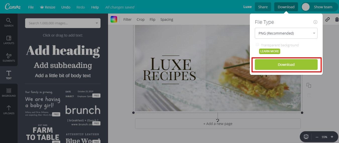
You are now free to use it anywhere you like. Create your Facebook ad and run this design to see how it works for you.
Repeat these steps until you come up with a design that actually works for you.
You May Also Like This:
Guide on Facebook Pixel Helper
How to add facebook pixel to shopify
Facebook Ads Account Disabled
11 Facebook Audience Insights Hacks To Generate Sales
Final Words
Now you know who your target audience is, what are you offering, what problems does your product solve, and what you want the consumers to do.
You know how to use psychology and emotions to your advantage.
These are all the tools you need to actually create the Best ad that brings in a lot of sales and helps grow your business.
We hope we cleared everything up for you.
Let us know what you think about this guide, all your questions, critiques, and comments are welcome.

 Facebook Detailed Targeting – How to Get the Most Potential Customer
  How to Sell on Facebook Marketplace?
  Facebook Video Ads Guide – How to Make Profitable Video Ads in 2020
  How Much Does Facebook Advertising Cost?