26 eCommerce Mistakes to Avoid – A Guide for New Entrepreneurs
- Jun-25-2018
- Saleem Ahrar
- 5 comments

E-commerce is taking over, even the biggest brick-n-mortar businesses are moving towards a digital presence. But, even the best companies have no idea how small things have the biggest impacts. Its relatively easy to create and launch an online store given the abundance of platforms available. The real test is to optimize minor elements of eCommerce stores to encourage visitors to buy and create trust. I have analysed queries and problems from our official Shopify group on Facebook and noticed that there were a lot of common problems every e-commerce entrepreneur faced.
I have put together this list of 26 eCommerce mistakes to avoid for every new entrepreneur to create a lasting business.
- Bad Search Button Placement
- Improper Slider Images
- Unreadable Fonts & Text with Bad Colour Schemes
- Missing Details on Product Pages
- Not Using Urgency Apps on Product Pages
- Additional Steps Instead of Checkout Page
- Not Highlighting Checkout Button
- No Delivery Details on Product Page
- No Cart Reserve Timers in the Checkout Page
- Why Are All Items on Sale?
- Frequently Asked Questions (FAQ) Page Absent
- No Contact Us Page
- No About Us Page
- Huge Logos & Brand Names
- No Re-Assurance Factors or Comfort Content
- No Terms & Conditions Page
- No Privacy Policies
- No Currency Converter
- No Recommendations or Related Items
- Product Reviews & Ratings Missing
- Social Proof Missing
- Shipping Rates Not Mentioned
- No Product Video Demos
- Dead Live Chat
- No Categorized & Sub-Categorized Products
- No Order Tracking & Reporting System
Bad Search Button Placement
A very basic and common eCommerce mistake to avoid is the placement of search buttons. The search button is a most used feature on eCommerce stores. It creates ease of use for buyers, therefore, not only should it be visible it should also be ideally in the right side of navigation. The reason for this recommendation is primarily because of ease of access. 
Most online stores are published in languages written from left to right. Hence, naturally visitors are mentally programmed to look up to their top right for the navigation bar, where the search option usually appears. Placing the search button in odd places causes visitors to abandon the eCommerce store without even looking at your products.
Therefore:
- Ensure the search button is visible, usually indicated by a magnifying class icon
- Place the search button in the right navigation (recommended)
- Add a search bar … it is also a great idea
Improper Slider Images
Having a slider with images of products is absolutely fine, it’s both attractive and a trigger for buyers to look at products. However, after careful observation I have noticed most new web stores have several issues in their slider images, one of very common eCommerce mistakes these days. 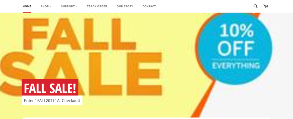
The most common issue is the absence of proper high quality product images. Images moving in the slider are blurred and give a bad perception to the customer. Images should be high definition and not too LARGE to take up half the scrolling space of your home page. An attractive high quality product image is certain to trigger a response form buyers.
Another problem with the same image is its size. While it’s good to have a clear product image, store owners tend to place very large images in their home page slider. It is ideal to place medium sized images that are properly aligned with each other, are not blurry and low quality.
Therefore:
- Ensure Slider images are high definition
- Do not publish the same pictures your supplier does
- Align all product images to be the same size
Unreadable Fonts & Text with Bad Colour Schemes
A very common eCommerce mistake that I have experienced in over 100 eCommerce stores is rash attention towards fonts, colour schemes and text. At times different browsers’ didn’t even show some text in buttons and navigation menus. eCommerce website design mistakes are easy to avoid, so its better being proactive with your design and its smaller elements. 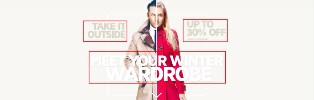
It is recommended to use a single font family across your online store. The font should be readable, clear and attractive when used with the store them. This also applies to the size of fonts. Using too large fonts can be, foolish, if you ask me. The same goes for using too small font sizes.
The Colour Scheme used is a massive aspect when analysing the appeal of your eCommerce store. Warm colours and your text could be completely invisible, too light and it could be annoying to the eye. Consider a colour scheme that highlights the text and at the same time delights buyers.
The placement, size and length of text is crucial. Too long and it may counter-react with your theme, so always consider using concise text for menus, search, buttons and slider text. For example, using the test “Search for Products Here” can be replaced with “Search”. Hence, it is better to avoid ecommerce website design mistakes proactively than suffer and do it later.
Therefore:
- Use one font family across all landing pages
- Maintain font size in headings, blogs, product description and all other sections
- Use trending colour schemes that comply with your fonts and buyers like to see
- Use text that is ideal in size and not too lengthy, especially for buttons
Missing Details on Product Pages
Probably the most important, yet biggest eCommerce mistakes I have seen mostly on new e-commerce stores. Product pages are missing crucial details, even product specifications at times. This results in visitors completely abandoning the product page, with no value for them in it.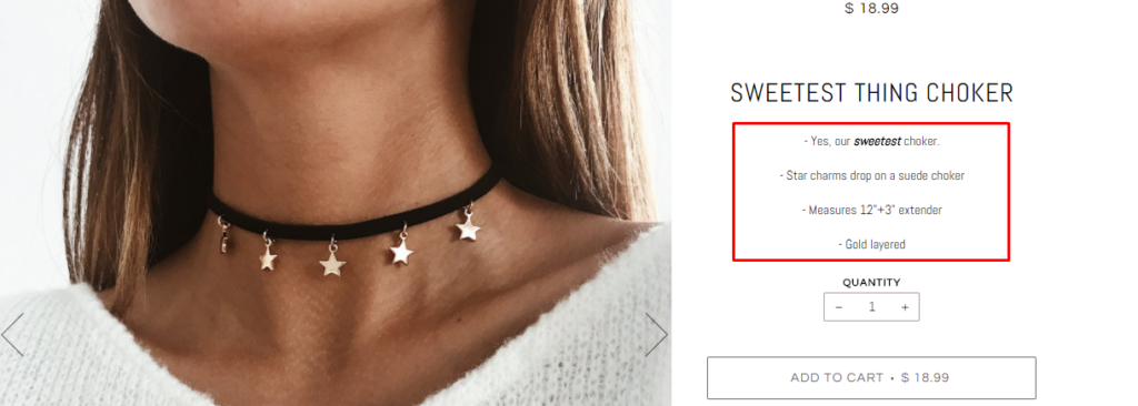
It is recommended to include as much product details as you can. A brilliant example is looking up product descriptions and details on Amazon. The first aspect to pay attention to are product specifications. Give buyers details of size, shape, colour, storage, technologies used, benefits of using and any other details that will trigger a sale.
The product page must also offer details of returns policies, process in case of damaged goods, shipping details, deliver details and other important after sales information. You can also include clever details of packaging, gift wrapping services, comparison button with other products, plus any other customization details. Remember that this is a very common eCommerce mistake and must be avoided at all costs.
Therefore:
- Include as much product details & specifications as possible
- Mention delivery, return, damaged goods process and quality details
- Include primary benefits of using the product
- Avoid copy-pasting details provided by the seller
- Consider including packaging and wrapping details
- Add Comparison buttons to quickly compare similar products
- Display customization options
Related Article:
How to write product description
Not Using Urgency Apps on Product Pages
Instant product sellers, Urgency Apps are designed for Shopify & WooCommerce stores to display limited stock or discount. Visitors consider the quick selling & trending item with intent to buy.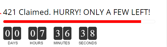
There are some brilliant urgency apps on the Shopify app store that trigger immediate action from buyers. Hurrify countdown timer app available on Shopify is the most successful app for urgency. The app places a countdown timer next to your product, creating the urgency that items are limited.
Urgency apps are highly customizable to display number of times items have been sold, units remaining plus several other tricks. According to developers urgency apps increase conversions up to 3 times depending on your industry. Not creating urgency on your online store is one of eCommerce’s biggest mistakes, let the customer know about stock availability in advanced its better than losing sales.
Therefore, ensure:
- Install an urgency app with your trending products to get 3 times more sales
Additional Steps Instead of Checkout Page
Another common eCommerce mistakes to avoid is displaying additional steps in the cart page instead of moving buyers to the checkout. Ecommerce stores begin displaying additional buttons to push customers to buy more rather than moving them to their checkout. This by far is the most annoying & common eCommerce mistakes found on online stores. 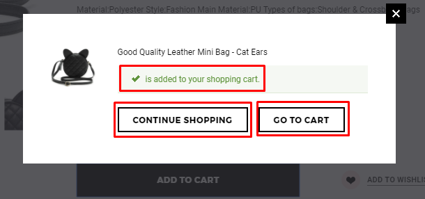
Instead of displaying useless buttons that lead elsewhere, consider displaying a “Checkout” button to take shoppers to their cart page. This can then allow you to suggest other products at checkout, instead of misleading the buyer with irrelevant stages of the journey. One example is displaying an Update Button, a Continue Shopping Button or other buttons leading elsewhere.
Therefore:
- Provide customers with a Checkout button only
- Do not display irrelevant buttons and route buyers through more steps
Not Highlighting Checkout Button
I can’t say if it’s a mistake or a general misconception amongst online store owners, but highlighting the update button doesn’t get them anywhere. The update button either redirects the buyer to another product page or simply updates their cart items, see no use doing it.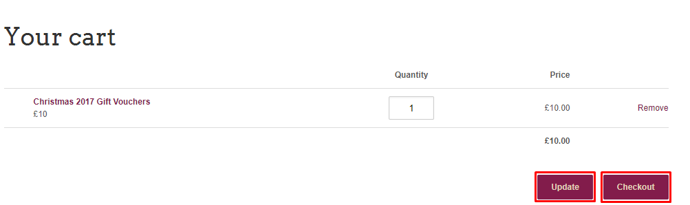
Highlighting the checkout button will not only makes the journey easier, but also build trust between the eCommerce store and buyer. As I mentioned earlier, adding buttons doesn’t make the process any easier. A ‘Dull’ or unnoticeable Checkout button is a VERY BIG MISTAKE, always use trending colour to make it prominent.
Therefore:
- Always highlight the Checkout button, not other CTAs
- Not to route buyers anywhere else but the Cart Checkout page
- Use appealing, eye catching and trending colours for Checkout Buttons
- Make checking out easier for buyers
No Delivery Details on Product Page
Not mentioning the delivery time of products is not just an eCommerce mistakes to avoid, IT IS CRIMINAL, but that’s just my perspective. In an age of perfect information missing out on this crucial detail can lead to dissonance and even cancelled orders.
Consider it this way, the more information the product page provides during the sale the less time is spent answering user queries later. AliExpress usually provides the delivery times ‘2-3 weeks’ or ‘4-6 weeks’ and is a very good idea. Similarly, POD online store can have products delivered in 3-7 days with next day delivery also available in most cases.
It is recommended to mention delivery times with an attractive icon or mentioned in prominent bold text.
Therefore:
- Mention the delivery time of products
- List the delivery time with attractive graphics or prominent text
No Cart Reserve Timers in the Checkout Page
The absence of a cart reserve timer is one of the top eCommerce mistakes to avoid. Its sneaky yes, but its also a motivator for shoppers to actually checkout instead of abandoning.
Deploying a cart reserve timer on the checkout page can be immensely profitable for an eCommerce store. Boosting the fear of missing out on their shopping list that took 30 minutes to add, will trigger a natural response to checkout. Not only does it create urgency but can also trigger immediate payments. This slick little tool maybe a bit cheesy, but it can do your sales a great favor. 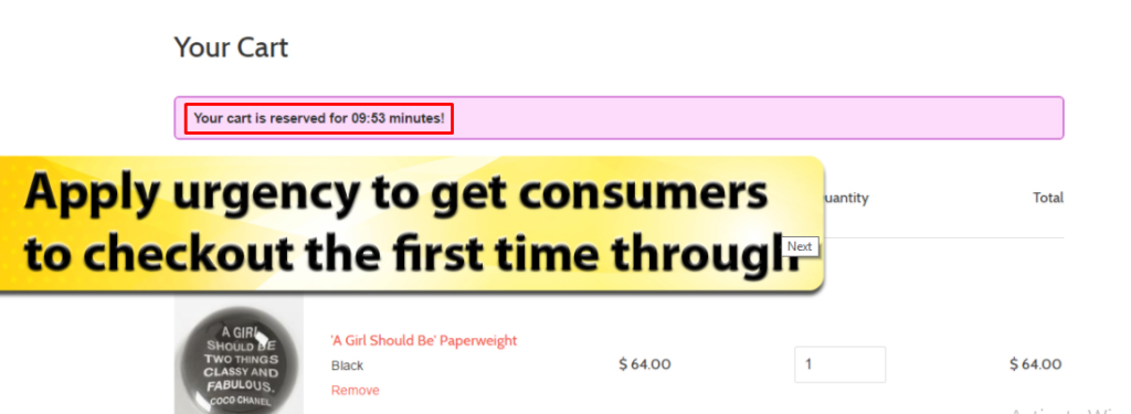
The Cart reserve timer basically notifies buyers that their cart items will be emptied in 5, 10 or 15 minutes. This triggers a psychological response to either pay immediately, or add more items quickly. Having this timer can decrease checkout abandonment (recorded at 68% in 2016) and simply increase sales that could have been lost.
Therefore, ensure:
- Creating urgency with a cart reserve timer app
Why Are All Items on Sale?
Unless a webstore is observing a clearance sale or closing down there is no point putting up all product in the catalogue on sale. Only products that are top sellers or very highly priced should be shown on sale. If all items are on sale all the time, there will be no point running campaigns in holiday seasons and special events like Christmas. This very common eCommerce mistake to avoid, customers will not buy simply because items are on sale. 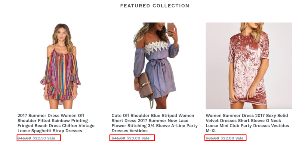
This will certainly discourage buyers when they compare prices with another webstore. If the price on another ecommerce store is lower than sale offer price, they will abandon their cart.
Therefore:
- Do not put up the entire product catalogue on sale
- Use clearance sales for seasonal events & holidays
Frequently Asked Questions (FAQ) Page Absent
Wouldn’t it be nice if half your buyer queries are resolved without even contacting customer support? That is exactly what a FAQ page can do. As I have noticed, most web-stores completely disregard frequent questions. This leads to increased dissonance and disgruntled customers. One of the most massive & very common eCommerce mistakes to avoid, always create an FAQ page for your visitors. 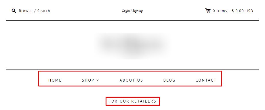
These frequently asked questions like shipping times, delivery times, product replacement and returns etc. can resolve customer queries without even contacting support. FAQs can include queries like:
- How do I return a product?
- How do I get a refund?
- What to do if I receive the wrong product?
- Do you ship internationally?
- How much is shipping to my country?
- What payment methods do you offer?
- I provided a wrong address, how do I change it?
- How do you secure my financial information?
Creating and populating a FAQ page is not even difficult. You can browse FAQ pages of ecommerce stores online to see what the most common questions that are addressed. This also creates a sense of delight & trust in the customers mind. After sales service carries more value than the actual sale. FAQs should be the first point of contact for your buyer rather approaching a busy live chat or 24hour response email ticket.
Therefore, ensure:
- Creating a FAQ from day one
- Answer common issues/queries directly related to the web-store
- Keep customers happy by being pro-active
- Always consider after sales service as important as making the sale
No Contact Us Page
The absence of a Contact Us page can be very damaging for an online store, and is a common eCommerce mistake. If the buyer has no means to contact the web-store, the seller cannot create any trust with visitors let alone buyers. The issue is common among most new online stores, the absence of contact information creates mistrust in the customers mind.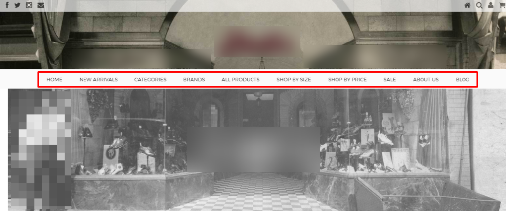
An e-store should be present over several mediums including social networks, live on-site chat, phone, email, and video calling if possible. This will create great trust between buyer and e-store, in addition giving the buyer a channel to reach the store. Being a common ecommerce mistake, it is the reason many e-stores don’t survive for too long.
Therefore:
- Create a dedicated Contact Us page
- Create e-store profiles over social networks
- Publish a dedicated phone number for the e-store
- Encourage buyers to reach support over video calls
- Install a live chat
- Offer an email support form on the Contact US page
No About Us Page
The absence of a dedicated About Us page is a serious eCommerce mistake, and is a very common eCommerce mistake. The reason is simple, buyers & visitors will not trust the online store. Offering company information, location, personnel information and phone numbers builds massive trust in buyers’ minds.
Usually, located in the footer the About Us page may not be a highly visited page but only the existence of such a page can build massive rapport with buyers. The page should align with the rest of the webstore and if possible should offer a Google Maps location. This is one of the most significant eCommerce mistakes in addition to a contact us page.
Therefore:
- Develop a proper About Us page
- Mention location, address, phone numbers and maps location
- Build strong rapport & trust with buyers
Huge Logos & Brand Names
If the web store logo or brand name takes up the top fold of your eCommerce store what is the point of having the store front? Even in a brick-n-mortar business you may have never seen a billboard that covers the entire front of the store. This eCommerce website design mistake can cost the online store dearly, as the buyer cannot see products, only a huge logo or brand name. This just makes the experience difficult for the buyer. 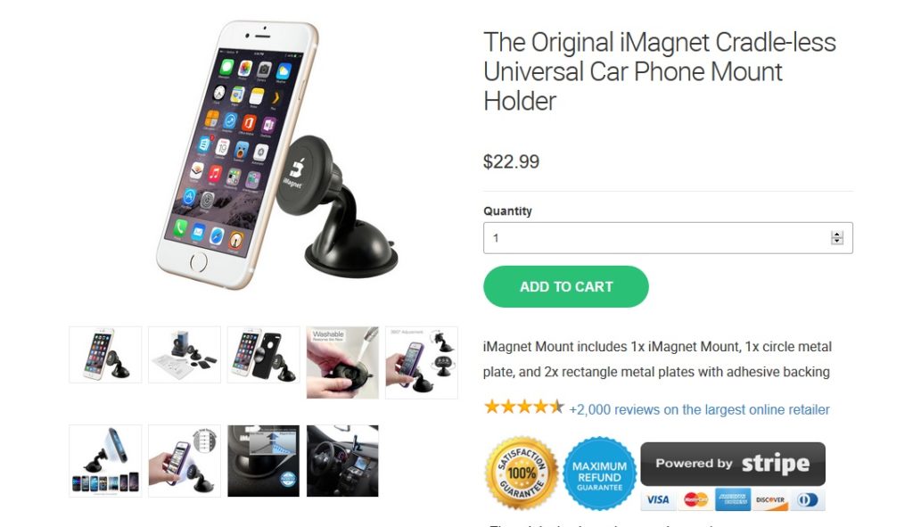
Consider publishing an ideally sized logo and brand name to give products & offers more space. The home page will then offer more area for sliders, active sales and other elements to trigger a sale. Huge images, logos and text may look attractive but aren’t what your buyers are looking for. The buyer is interested in the latest deal, or trending product which they should see as soon as they scroll down the home page.
Always consider fixing eCommerce website design mistakes before launching your e-store rather re-actively disturbing the design later. Therefore:
- Avoid placing huge logos & brand name on the web store
- Avoid large size images that take up half the space on product pages
- Make the shopping experience easier for the buyer
No Re-Assurance Factors or Comfort Content
Missing re-assurance factors (also called comfort content) with product descriptions are a very common mistake I have mostly noticed on new e-stores. These factors like 30 Days Money Back, Hassel free returns, SSL powered payments, available payment methods etc. can be significant to trigger sales from even “just” browsing visitors.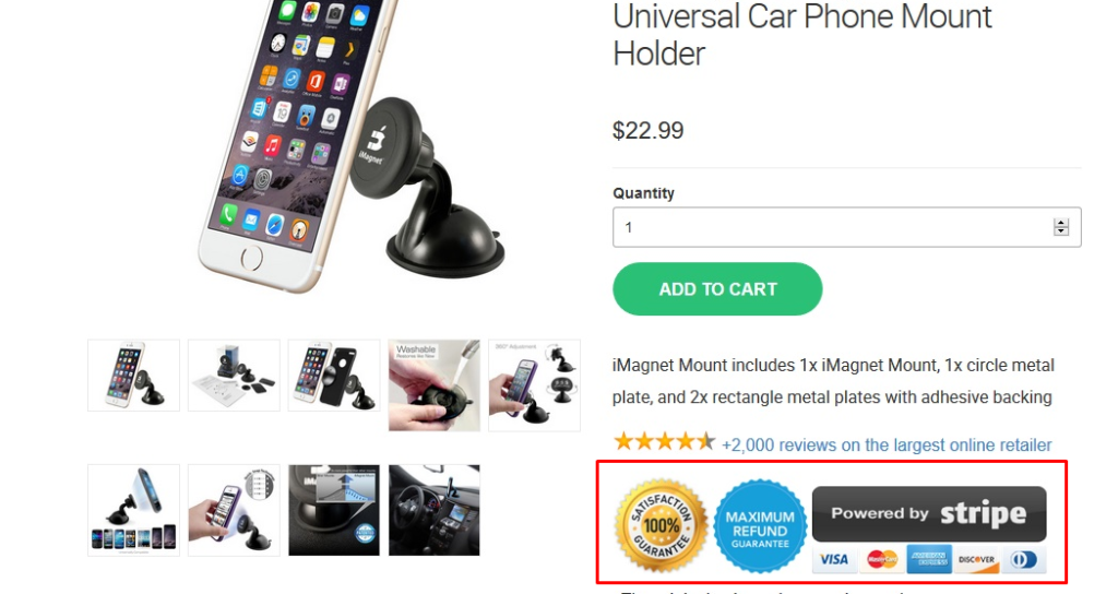
Including reassurance factors with your product gives the online store authority. For instance, a 30 days money back guarantee will give the customer surety that they can return the product if there is dissonance. A SSL Payment gateway will convince the customer of secure payment. Depending on nature of the products, eCommerce stores can include anything that comforts the buyers mind to proceed with the purchase. Show buyers that you care for them, their data privacy, and payment information.
Therefore:
- Add comfort content in product pages
- Use re-assurance factors related to products
- Convince customers the e-store cares
No Terms & Conditions Page
A terms and conditions page is not required by law, but is an essential element for online stores. A common missing element on most eCommerce stores, terms & conditions pages define rules buyers must agree to use an ecommerce store. Terms & conditions pages sets important rules including those for preventing abuse, copyrighting content, account termination, limiting liability and defining prevailing laws.
Defined terms and conditions ensure that users maintain certain ethics when commenting and purchasing from your store. This builds trust in buyers’ minds and defines the authority of store owners.
Therefore:
- Add a broad T&C page for the e-store
- Define the rules of using the e-store
No Privacy Policies
A mandatory document now for any website, Privacy Policies are usually missing from most online stores. Not having a privacy policy is a big mistake, since visitors are concerned about the data they submit over a website and how it will be used. This document underlines:
- The functions of the web-store
- Information collected
- Methods of information collection
- How information is stored
- Contact information of management
The privacy policy should be a broad document, easy to understand, accurate, and must address any hidden clauses. It is also essential to routinely update this document based on changing internet privacy laws. Maintaining a privacy policy creates a sense of security & trust amongst buyers. This document also defines the security provided to customers’ financial information.
Therefore:
- Create a mandatory Privacy Policy
- Define information collection, payment security, information storage, site usage and use of information
No Currency Converter
Installing a currency converter app is a great idea. It saves buyers the hassle of going through a Google tab to check how much products cost in their currency. As I have noticed it is a very common mistake across most new e-stores. Imagine if your customer goes off to Google to convert and never returns to your store, that’s sales lost.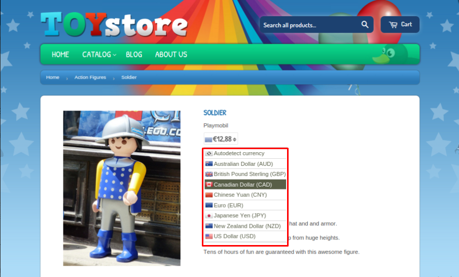
It is a great idea to have a currency converter that can be both automatic and manual. The automatic currency converter shows product prices based on the buyer’s IP address. A manual currency converter is usually accessible in the top navigation of most e-stores. Buyers can select which currency they want the prices to be shown in.
The prime advantage is keeping the buyer on the web store and saving the trouble to convert prices on Google or another website.
Therefore:
- Consider installing a Currency Converter plugin
- Currency converters are available in both free and paid versions
- Automatic & manual currency converters can be installed
No Recommendations or Related Items
A good element to have on an e-store, complimentary items are usually shown when a buyer is either browsing or when adding an item to cart. Another common mistake new e-stores make, this is a possible upsell trick to increase sales.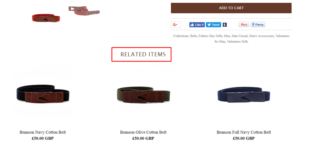
A related items section is a brilliant way to display complimentary products, higher quality substitutes, and product bundles to buyers. This feature also allows displaying recently viewed products to buyers to encourage sales of popular items. Shopify & WooCommerce both offer a sweet selection of apps to display related items within product pages and at checkout.
Therefore:
- Consider installing a related items app or plugin
- Show your customers more complimentary items
- Upsell by displaying higher quality products
- Cross-sell by displaying product bundles
Product Reviews & Ratings Missing
An essential element for any e-store, and the biggest mistake most new e-stores make. We now know that 23% of online shoppers in US are influenced by social and on-site product reviews. 69% of US online shoppers also demand products are highlighted with authentic user reviews. 42% store owners have previously reported a growth in sales when publishing user reviews. Product reviews can make or break a purchase, and hence fall in the category of top eCommerce mistakes to avoid. 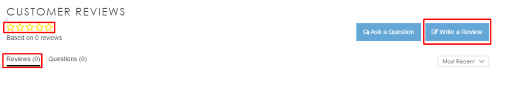
Reviews not only build trust, but also give buyers a realistic preview of products. For e-stores reviews are immense as they can gauge the quality of products & customer satisfaction. Another important feature to add are product ratings. Usually signified by stars, this is a great way to project the satisfaction of customers who have rated a product between 1 and 5.
Reviews & Ratings build a concrete reputation for e-stores, encouraging customers to return and recommend others too. For new e-stores it can be a problem publishing reviews since they have none. e-Stores can import reviews from AliExpress, Amazon, eBay and other sites hosting the same product easily with apps. There are both paid and free apps available to host reviews on e-stores.
Therefore:
- Publish reviews with catalogued products
- Import reviews from other websites using apps
- Build trust and give buyers a realistic preview
- Publish ratings of products
- Avoid publishing fake reviews, they are identifiable
Social Proof Missing
An intelligent trick to convince buyers and encourage sales, social proof apps are now a must have for any e-store. Social proof is also known as informational social influence. It’s a psychological factor that influences buyers to copy the actions of other buyers, monkey see monkey do! Not including social proof ranks in my top 5 eCommerce mistakes simply because the age of the celebrity is over. Online Buyers are influenced more by reviews of other buyers than those acting as brand ambassadors. 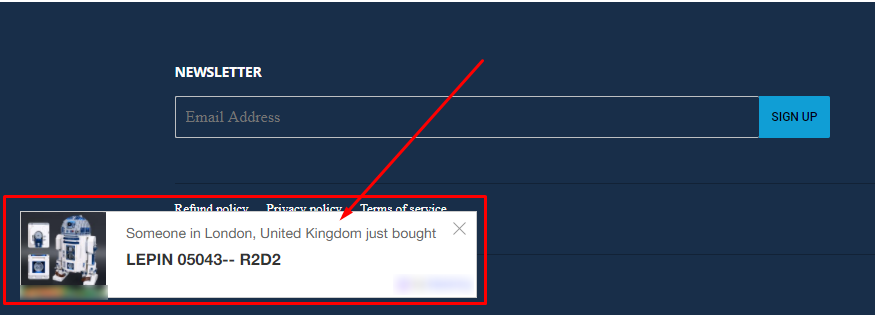
But, although this trick is quite effective, most new e-stores miss out on this amazing feature. Robert Cialdini writes in his book ‘Influence’, “the tendency to see an action as more appropriate when others are doing it.” Buyers are influenced by other buyers looking at a particular item, its basic human psychology.
It can come in many ways like social proof from experts, influencers, celebrities, other buyers, and friends. Testimonials, rating, reviews, badges and media logos also fall under this category. Buyers will always be uncertain about purchasing products online. However, a little nudge by another buyer will encourage the purchase.
With a number of social proof apps and techniques now available in both Shopify and WooCommerce, it’s a great way to optimize conversions. Social proof removes doubts from the buyers minds, giving e-store great reliability.
Therefore:
- Use social proof techniques with trending products
- Consider installing apps
- Allow influencers to demo your products and publish reviews
- Use ratings, reviews and testimonials with products
Shipping Rates Not Mentioned
Most e-store owners simply consider this irrelevant but eCommerce shipping mistakes will cost you. It is very crucial for customers to see ideal shipping rates they will pay for products. BigCommerce reports that “66% of US online shoppers decided not to buy an item because of shipping costs”. 72% female shoppers and 59% of male shoppers in USA abandoned sales when they found out the shipping rates later in the journey. 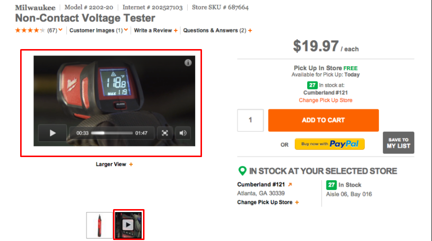
It’s very important to negotiate good shipping rates with your shipping company. Too expensive and 66% of your shoppers will leave as I mentioned above. There should be a mix of shipping rates like free, paid, and a mix depending on the location of buyers. Avoiding eCommerce shipping mistakes, before customers start swarming your customer support is better and time saving.
Therefore:
- Negotiate appealing shipping rates with companies
- Create a mix with free and paid delivery offers depending on product
No Product Video Demos
It’s a trending content type, and now essential to grow into a popular e-store. I have not seen a video demo on either new or medium sized e-stores, a very common mistake. Stores that do carry video demos secure better sales and are more reliable in comparison to those that dont. BigCommerce reports that 42% of online shoppers demand a video demo for products.
Video demos can be highly productive and all they require is a product sample you can record while using. Product videos & demos can teach customers how to use the item, teach them new tricks, and demo the quality. Videos build better understanding of products, give e-stores reliability, build buyer trust, and brand power.
The excellent aspect of videos is that you can share them over several platforms and even embed in blogs, news stories and articles.
Therefore:
- Create Video demos & reviews for trending products
- Publish them on several channels
Dead Live Chat
I have noticed dead or unresponsive live chat on several e-stores which is one of few criminal eCommerce mistakes. A dead live chat is the doorway to lost sales and negative brand image. It is essential to keep in touch with customers, and respond instantly to queries. Customers commonly use live chat to contact support and problem resolution.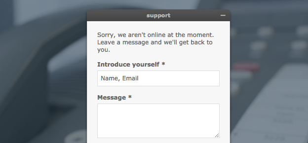
If there is no one to assist over live chat, I recommend removing live chat and consider email support. E-stores can also opt for Facebook Messenger rather than live chat tools. e-Stores should also use bots instead of carrying a dead live chat. Your product pages should provide all important delivery, shipping, product quality, packaging, and other details so the customer has all information beforehand.
Therefore:
- Do not use Live Chat on e-stores if there is no one to answer
- Consider using Facebook Messenger
- Opt using bots if there is no human support available
- Provide as much details as possible before hand
No Categorized & Sub-Categorized Products
Browsing through mostly new e-stores you will notice fewer categories with most products clustered into one huge section. This is a very grave mistake, e-store owners should avoid.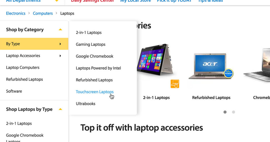
Categories make life easier for a customer to browse products and quickly get to the section they want to shop in. It also makes the e-store look professional, organized, and appealing to the buyer. It is also recommended to use sub-categories for easy access. Category management is in fact a defined area of control that should be looked after routinely.
Category management experts EKM offer the “Two Rules of Three”:
- Customers must see the start of the path within three seconds of landing on your web store.
- The product they want should ideally be no more than three clicks away.
Categories should be simple, they should have confusing long titles. Instead of titling a category Men’s Sweater for 25 to 30, just label it Men’s Winter Wear. Another important aspect to add to categories are appropriate filters for buyers to quickly find their products. It’s also good to routinely visit competitors and see how they manage categories to get an idea.
Therefore:
- It is recommended to categorize & sub-categorize product catalogues
- Use simple category labels
- Make navigation easier for buyers to get to their products quickly
- Consider category management a core function of the e-store
No Order Tracking & Reporting System
An order tracking system is a best practice, but still not available on majorly new e-stores, a crucial eCommerce mistake to avoid. With a number of apps that can integrate with the e-store the order tracking process is now fairly easy. Order tracking makes it easier for customers to directly check the status of their purchase. This removes the requirement for them to contact support and wait long times for email replies.
The most important advantage of order tracking is trust and reliability in the buyers mind. Another important benefit is that the customer will return to check their order status leading to more sales. Order tracking may also reduce expensive call costs for the customer and offering them quick delivery information.
Order tracking plugins available for both Shopify and Woo-commerce keep the customer on e-store pages. eCommerce stores can also provide a link to the order tracking of the courier company. This significantly reduces the work load off customer service who can then deal with other issues.
Therefore:
- Add an order tracking system to the e-store
Happy Sale Hunting E-Store Owners!
I Hope you enjoyed the first installment of our 30 eCommerce mistakes to avoid on new e-stores. If you like my guide remember to share it with friends, and do remember to leave your feedback for improvement.
Join us on our social profiles and feel free to contact us. Be part of our ever growing community of entrepreneurs and eCommerce enthusiasts and remember to sign-up to our news feed for more amazing resources & educational material.

Saleem Ahrar is an accomplished eCommerce enthusiast with a wealth of knowledge and half a decade of experience. A gym-addict and reading enthusiast, Saleem enjoys mentoring newbies with his expertise & knowledge in digital marketing. His belief in the quote “hard work conquers all”, is the defining crucible of his never quit attitude.
It is a valuable information. Thanks for sharing it and these mistakes should be avoided for better performance to the eCommerce store.
Super-helpful. Thank you so much!! I think I am making almost all of the mistakes you have listed, so I will begin correcting them now. 🙂