Shopify has done wonders for lowering the barrier of entry for would-be e-commerce entrepreneurs. However, with this influx of so many one-man-show online stores, many people are finding themselves lacking in skills, resources and expertise necessary when it comes to making their online store a converting one.
The American Marketing Association defines a conversion as “The desired action you want a visitor to take on your site.” This can be anything from a purchase to a click on a button that performs a function (such as an email signup, for example.)
Pretty much all of the Shopify store owners that I regularly talk to in our Shopify Tips Facebook Group tell me that most of their traffic comes from either Facebook ads, or paid influencer posts. This means that most Shopify entrepreneurs out there are not only investing their time, but also money to generate every single visit. Nailing the conversion rate aspect of your store thus becomes a necessity.
I reached out to a few experts in the e-commerce communities I partake in to share their best conversion rate optimization hacks with me. Here are 5 Expert Tips On How You Can Improve Your Shopfiy Store’s Conversion Rate!

Harris’s Own Conversion Optimization Tip: Removing Images like these from the top fold of your articles reduces bounce rate and increases the percentage of the total page length that users scroll down to!
A/B Test How You Display Your Products


By GRANT SEGALL
Founder of Tsunamiclick.com
“Even the slightest modification to your store can cause your conversion rate to decrease. “
We have a rule of thumb at our CRO agency that basically says, “will making this change on the client’s website make it easier or harder for the customer to find our client’s product?”. While reviewing one of our client’s category pages, we spotted something that we thought would give the site a decent uplift in orders.
Here’s the scenario: Our client sells a boatload of dresses online. Dresses of all sorts and variations. There’s sleeveless dresses, short dresses, black dresses, you get the idea.
We devised a simple A/B test, one of the simplest tests you can run, on the category pages in your Shopify store. We are basically testing display settings based on the number of products per row on a mobile device. There is one caveat we must mention, always test your changes to your store. Even the slightest modification to your store can cause your conversion rate to decrease. How are you to know if the change produced a positive or negative result without tracking the response?
Keeping our agency’s rule of thumb in mind, put yourself in our shoes and ask, “which variation will come out the winner?”. Here are the two variations below. Guess the left picture (the original) or the right picture (the variation). Hint: put yourself in the customer’s shoes and pretend you are buying a maxi dress. Which option do you feel will help you find the right dress you are looking for easier, faster, etc.? You have 5 seconds (tick tock)…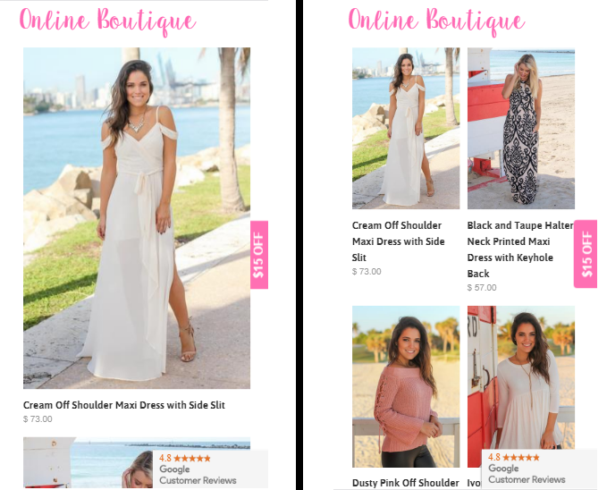
Time’s up. The results of the test show that the right picture (the variation) was the winner!

Here are the results for the winning variation:
- 16% more visitors visited an actual product page with the variation
- 12% uplift in transactions completed with the variation
- $8,489 more revenue generated in variation during the test period (12 days)
- Bonus: A significant decrease in bounce rate on category page
Conclusion: Test results show that visitors purchased more often when there were two products per row. The single row dress display would require the visitor to do a heavy amount of scrolling on a mobile device to find the perfect dress. The single dress display creates “friction” to move the product page and eventually get the order. We could also test 3 dresses per row vs. 2 dresses and check the result. That is the fun of conversion rate optimization, there is always something to test!!
Grant Segall is the Founder of TsunamiClick.com – a conversion rate optimization (CRO) agency. The team at TsunamiClick specializes in increasing the conversion rate of e-commerce, SaaS and lead generation companies.
Harnessing The Power of Wishlists
By ELDAR GAILEV
Founder of Growave
“No coupon codes or sales campaigns were used to reach these numbers. It is fully automated and works in background.”
Offering wish lists on your Shopify site not only creates a conversion action for your users to take before they’ve bought anything, but also serves as a bookmark that they can later share or compare with other products when making a purchase decision.
Yes, it looks obvious and it is.
Now you can do much more with the information of what people save in their wish lists.
Using this information, you can see which items are more popular. You can run email campaigns based what people save in their wish lists:
- send friendly reminders about items saved in their wish lists if they have not placed an order yet.
- notify users if the liked items are on sale.
- send an email if the saved item is getting sold out.
- offer a small discount like you do for any other abandons.
Filly Flair, a women’s apparel brand from South Dakota, is reaping all the advantages of wish lists. It is one of the most highly engaging features on their Shopify site. Also, wish lists based emails have high conversion rates.
Here is an example of one of their campaigns. It is a friendly reminder which is sent to users to let them know about the items in their wish lists that they haven’t purchased yet.

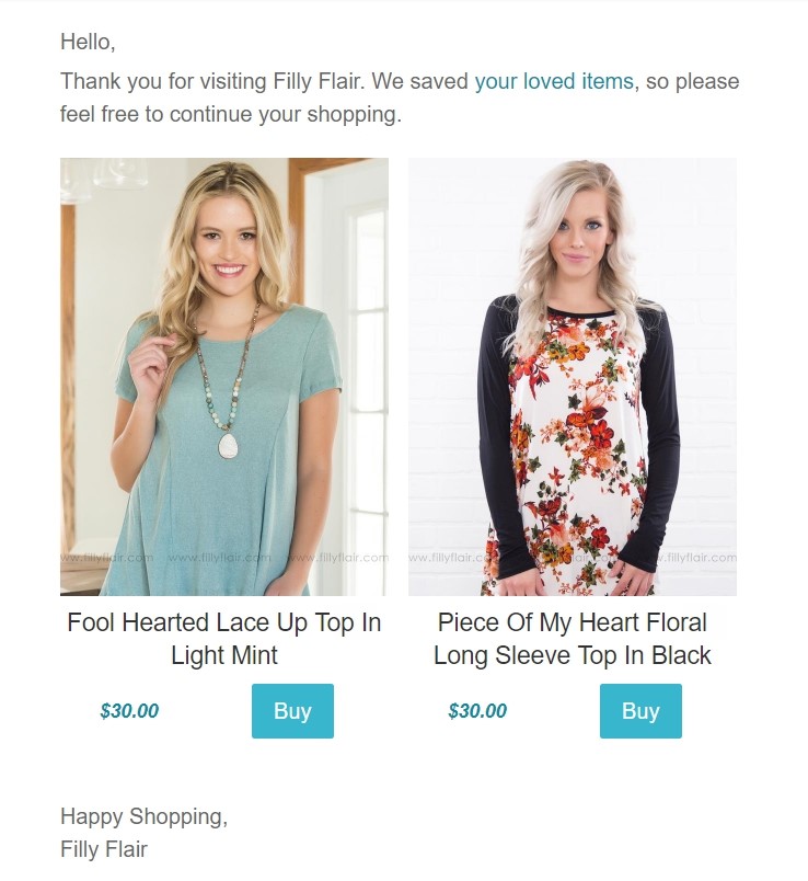
The click through rate for this email was a smashing 25%. And conversion rates were at 28%!
No coupon codes or sales campaigns were used to reach these numbers. No headaches and time-consuming management is needed. Once you get wish list based emails up and running, they’re fully automated and work in background.
Eldar Gailev is the Founder of Growave, an all in one Shopify app for driving traffic, increasing customer engagement and conversions.
Context-Based Personalized Content

By AHSAN PARWEZ
Full Stack Digital Marketer At CloudWays.com
“Users are highly more likely to click on content that is specially contextualized to their interests.”
Showing personalized content to your visitors can both greatly increase your conversions and/or reduce the time it takes for a visitor to make a purchase decision on your website.
So the question is, what does personalized content look like? Take GoDaddy as an example below… Which shows you different content that is personalized based on the visitor’s location. Here’s what visitors from the UK will see:


Pretty clever, right?
So for an online store you can, for example, show a visitor from Turkey a banner or offer that is celebrating a national event or holiday that might be happening on that day. This can be emphasized with clever popups or through content widgets. Users are highly more likely to click on content that is specially contextualized to their interests.

The tools that I have personally used which can serve this purpose are OptinMonster or Omniconvert, both of which can have integrated apps that you can find on the Shopify App Store.
Ahsan Parwez is a Full Stack Digital Marketer at Cloudways.com – A PaaS based managed cloud hosting platform that has helped e-commerce businesses around the world in building their online stores.
Conversion Bottlenecks In User Experience

By DAVID HOOS
Marketing lead at The Good,
“the central reason for low conversions is a poor user experience”
Since the challenges of each e-commerce store can vary wildly based on audience, the solutions will often vary wildly as well. However, there are a few tips I can share on how to best identify your biggest conversion bottlenecks and how to get started fixing them.
At its core, the central reason for low conversions is a poor user experience. Visitors want a user-friendly experience with as little friction as possible. The key to removing that friction is finding out exactly where it is. If they are forced to do too much work to complete a transaction, they’ll just go somewhere else.
In order to find out where your visitors are finding friction on your website use these steps.
- Setup your Google Analytics just like this: https://acquireconvert.com/shopify-analytics/
- Once you’ve done that, look at your Shopping Behaviour report. Find the transition with the greatest decline, and visit that page.
- Next, deploy user testing on it. There are options for doing this at different budget levels. For now, try one of the user testing tools from this usability testing tools list… Or ones such as Browsershots or ClickHeat.
Now typically, if you run around five user-tests with people who fit your target audience, you will uncover 80% of the major conversion bottlenecks on that page.
Start by fixing these high-value problems first. This will solve many of your major user experience problems. From there you can develop theories about why other parts of your site are under-performing and begin deploying A/B testing to find ways to improve them.
David Hoos leads marketing at The Good, a conversion optimization advisory in Portland, Oregon. He loves data-driven and customer-obsessed marketing.
Using Email Pop-ups The Right Way

By GREG D’ABOVILLE
Head of Growth at WisePops
“email marketing is both one of the cheapest and most effective ways of generating sales, if done right.”
On average, a customer needs more than 4 interactions with your website before converting into a buyer. This means you need a way to bring your new visitors back to your website (again and again) before they purchase from you.
Email is one of the best ways to do it. According to a survey among digital marketers, email marketing is both one of the cheapest and most effective ways of generating sales, if done right. And nothing beats email popups for building an email list. Need proof? Shopify expert and former Head of Content Richard Lazazzera has written extensively about why and how you should be using them to convert visitors into subscribers.
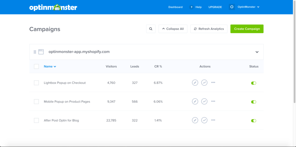
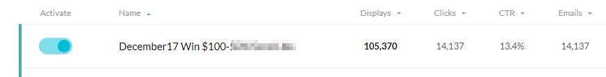
What percentage of visitors can you expect to convert? Somewhere between 4 and 15% depending on your offer and your industry (below is a capture of one of our clients who turns almost 1 in 5 visitors into subscribers).

To maximize your chances of success, I recommend you focus on the following elements:
- Pick a convincing incentive: most shoppers can’t say no to a discount code or a chance to win something.
- Work hard on your design: your popup should reflect your brand and attract your visitors’ eye. Be creative!
- Test exit popups: they perform best on average and are the simplest to put in place.
- Sync your emails with your ESP: send your new emails directly to your ESP to make the most of them right away
Greg d’Aboville is the Head of Growth at WisePops, an advanced popup app for Shopify.
That’s all for now. Time to put these techniques to the test. Do you have any original methods or ideas for increasing conversions? Share them in the comments!